- Published on
Grid 布局
- Authors

- Name
- Tsix
- Github
- Github
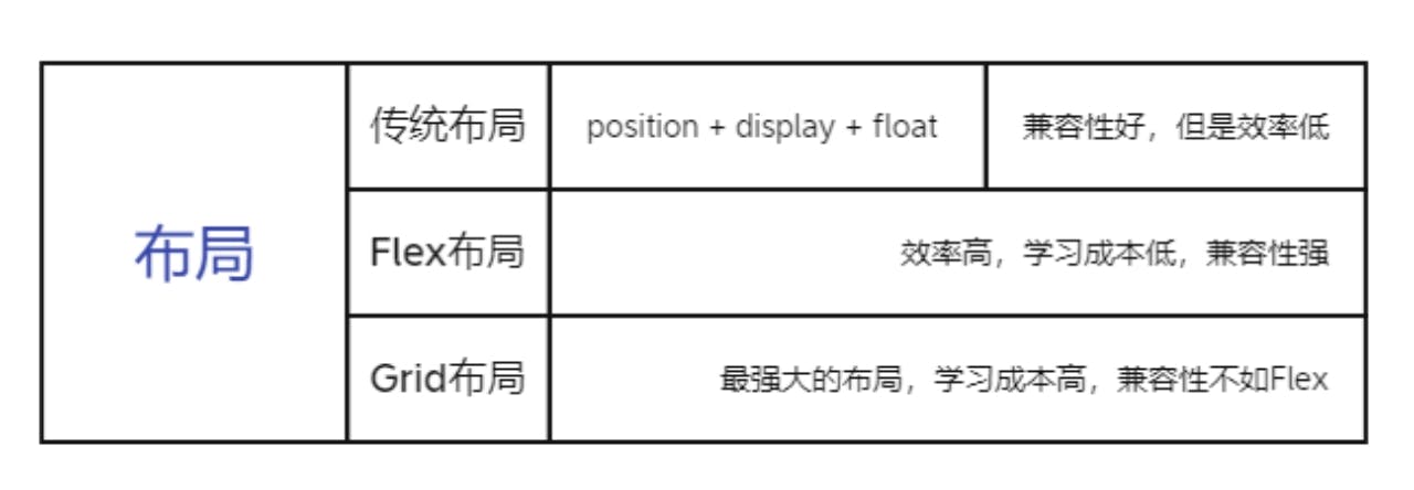
Flex 和 Grid 的 区别
Flex
轴线布局,指定项目针对周线的位置,可看作一维布局
Grid
将容器划分为行 和 列 , 产生单元格,然后指定项目所在的单元格,可看作二维布局,更强大
display 属性
display: grid 指定一个容器采用网格布局 grid-template-columns grid-template-rows
容器指定了网格布局后,接着就要划分行和列了
.container{
  display: grid;
  grid-template-columns: 100px 100px 100px;
  grid-template-rows: 100px 100px 100px 100px;
  }
除了使用绝对单位 也可以使用 百分比
repeat()
网格很多时,避免重复写代码,可以使用 repeat() 函数
  .container{
    display:grid;
    grid-template-columns : repeat(3 , 33.33%)   /* 第一个值是重复的次数 ,第二个是重复的值 */
    grid-template-rows: repeat(4 , 25%)
  }
重复某一种模式
grid-template-columns: repeat(2 , 100px 200px 300px )
auto-fill 关键字
有时候单元格的大小是固定的,但是容器的大小不一定,希望每一行可以自动容纳尽可能多的单元格,可以使用 auto-fill 关键字自动填充
grid-template-columns: repeat(auto-fill , 100px);
fr 关键字
如果两列的宽度分别为 1fr 2fr 。后者是前者的两倍
grid-template-columns: 1fr 2fr;
fr 可以和 绝对单位混合使用
grid-template-columns: 150px 1fr 2fr; /* 第一列的宽为150px 第二列的宽度是第三列的一半 */
minmax()
minmax() 函数产生一个长度范围,表示长度就在这个范围中,接受两个值,最小值 和 最大值
grid-template-columns: 1fr 1fr minmax(100px 1fr); /* 表示第三列宽 在 100px ~ 1fr 之间 */
auto 关键字
auto 关键字表示由浏览器决定自己的长度
grid-template-cloumns : 100px auto 100px ; /* 第二列的宽度基本上等于单元格的最大宽度,除非单元格设置了 min-width */
网格线的名称
grid-template-columns 和 grid-template-rows 属性里面,还可以使用 [] ,指定每一根网格线的名字,方便后面使用
.container{
  display:grid,
  grid-tempalte-columns: [c1] 100px [c2] 100px [c3] auto [c4];
  grid-template-rows: [r1] 100px [r2] 100px [r3];
}
网页布局中允许同一根线有多个名字,比如 [fifth-line row5]
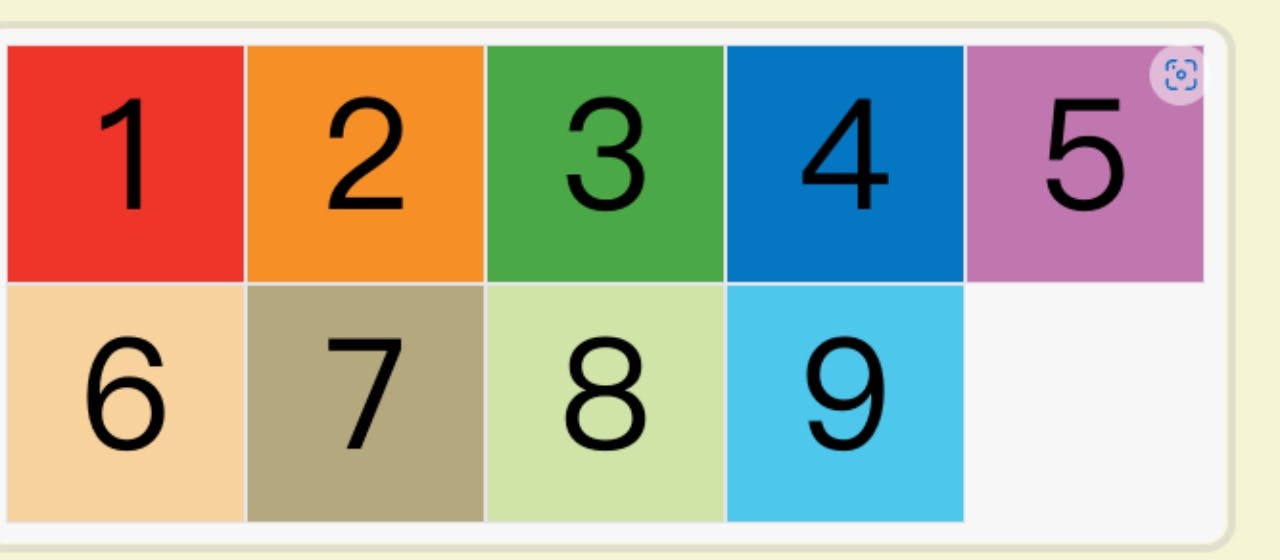
布局实例
.wrapper{
  display: grid ;
  grid-template-columns: 70% 30%;
}
上面的代码将左边栏设置成 70% 右边栏设置成 30% ;
传统的 12 格 布局,写起来也非常的方便
- grid-template-columns: repeat(12 , 1fr);
grid-row-gap grid-column-gap grid-gap 属性
- grid-column-gap 设置行间距
- grid-row-gap 设置列间距
.container{
  grid-column-gap: 20px;
  grid-row-gap: 20px
}

grid-gap 属性是 grid-column-gap 和 grid-row-gap的合并简写形式

.container {
 grid-gap: 20px 20px;
 /* 两个值相同,可以只写一个*/
}
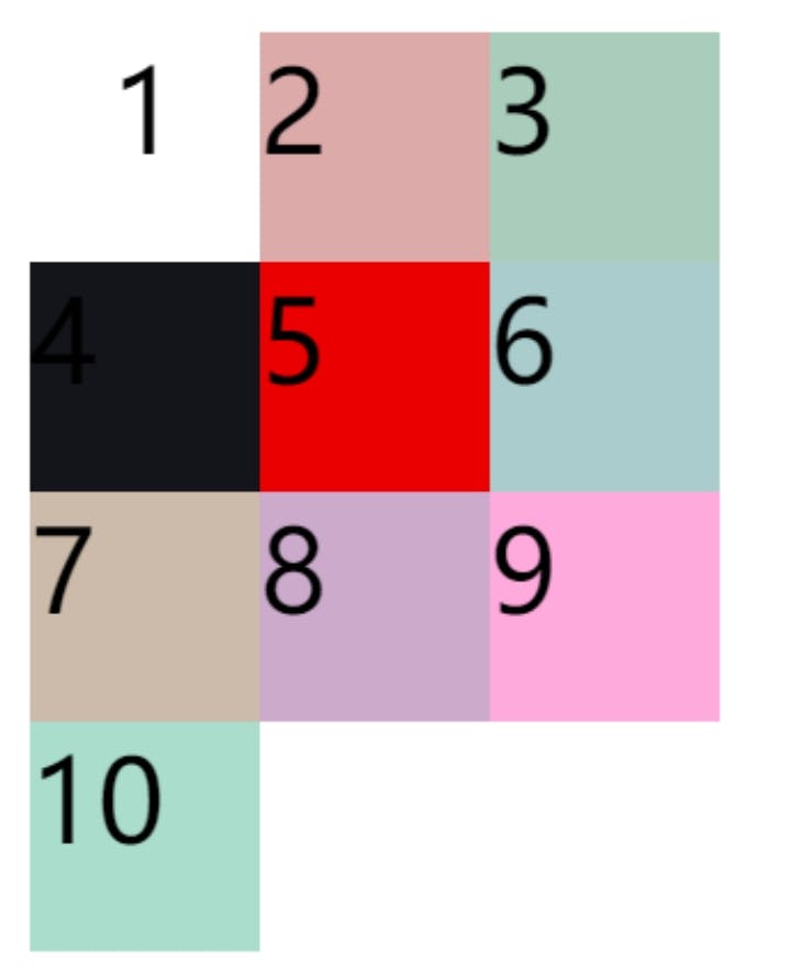
grid-template-areas 属性
网格布局允许指定区域(area),一个区域由多个单元格组成。grid-template-areas 属性用于定义区域
.container{
display: grid;
grid-template-columns: 100px 100px 100px ;
grid-template-rows: 100px 100px 100px ;
grid-template-areas: 'a b c'
'd e f'
'g h i';
}
/* 上面代码划分出 9个单元格 ,对其命名为 a-i*/
grid-template-areas:{
'a a a'
'b b b'
'c c c';
}
/* 多个单元格合并成一个区域*/
grid-template-areas: {
'a . c'
'd . f'
'g . i';
}
/* 某些区域不需要使用 就使用 . 表示 */
阮一峰的网络日志: 点击跳转